
Strategy-Led Redesign for Tower Grove CDC
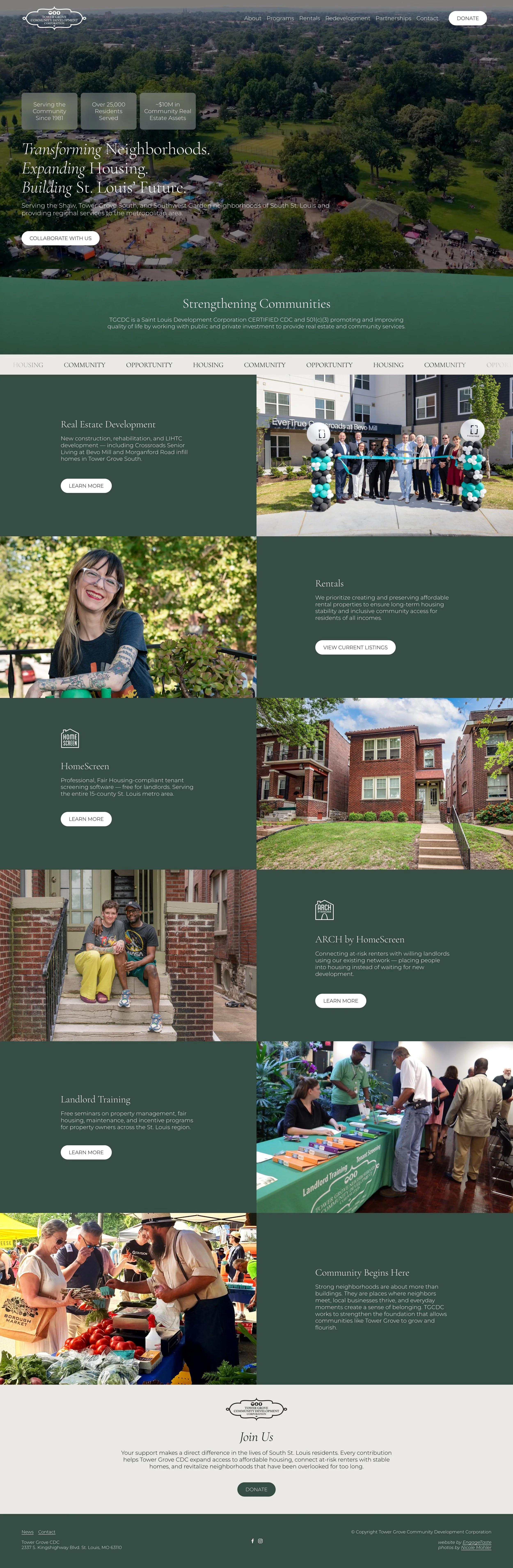
Tower Grove Community Development Corporation has been serving residents of the Shaw, Tower Grove South, and Southwest Garden neighborhoods for more than 40 years, with programs that now reach the entire 15-county St. Louis metro area.
Their previous 10-year-old website simply didn’t capture all that they do today, so it was time not only for a redesign, but also a reassessment. It needed to speak to very different people at once: renters looking for an affordable home, landlords looking for screening help or training, developers and public partners evaluating TGCDC as a collaborator, funders and donors looking for evidence of impact, and neighbors who simply want to know what is happening on their blocks. It also had to hold more than four decades of history, two program brands with their own websites, rental listings, events, annual reports and tax filings, and a donation path for a nonprofit that depends on public and private support.
Pre-Design Strategy
Before any design work, a series of strategy sessions reconfirmed what the website needed to accomplish over the next several years and what success would look like for each audience. Audiences were defined, along with where each one should be directed, so that a landlord looking for HomeScreen and a resident looking for a rental would not end up on the same page wondering where to go. The sessions clarified messaging and how TGCDC’s programs relate to one another, especially HomeScreen and ARCH, which operate under their own names and websites but needed to read clearly as TGCDC programs. User pathways were traced from a first visit to each primary action: collaborating on development, viewing rental listings, registering for events and training, and donating. The result was a structural framework for the site that decided which pages were essential, what belonged front and center, how existing content would be reorganized and consolidated, and what could live deeper in the site.
Visuals
TGCDC’s existing brand was retained, but softened to white, which allows the mark to sit directly over full-width photography and video in the header and opening sections without competing with the images beneath it. The program logos for HomeScreen and ARCH by HomeScreen received the same reversed white treatment on the homepage, so the two program brands appear as part of one family rather than as separate organizations.
New graphic elements were pulled from the logo itself. The individual leaves in the mark were separated out and used as standalone illustrations, and the outline of the logo became its own graphic. Each of the three statements that define the organization is paired with a single leaf: the ginkgo with the vision, the oak with the mission, and the ash with the values, tying every page back to the brand.
Photography of the community carries the story on every page: a ribbon cutting at a grand opening, renovated buildings, a tree planting, a landlord training workshop, and TGCDC’s own office, which matters to a local audience that knows these places.
Video adds movement to select pages. The first section of the homepage opens with an aerial drone shot that establishes the geography TGCDC serves, giving visitors a sense of the scale of the three neighborhoods. The video closes on a key handoff to a tenant, which brings the view from the whole service area down to a single household moving into a home. That final moment reflects the organization’s primary focus, and it is the first thing a visitor sees.
Structure
The original site’s extensive pages and content were reorganized and consolidated into a navigation built around how visitors would actually look for information. With this much information, strict organization and generous spacing were critical. Content is grouped into clearly separated sections, and each page has room between blocks so that a timeline with more than two dozen entries, a board of nine, and a decade of financial documents all remain easy to scan and navigate.