
Designed to Feel Like Home
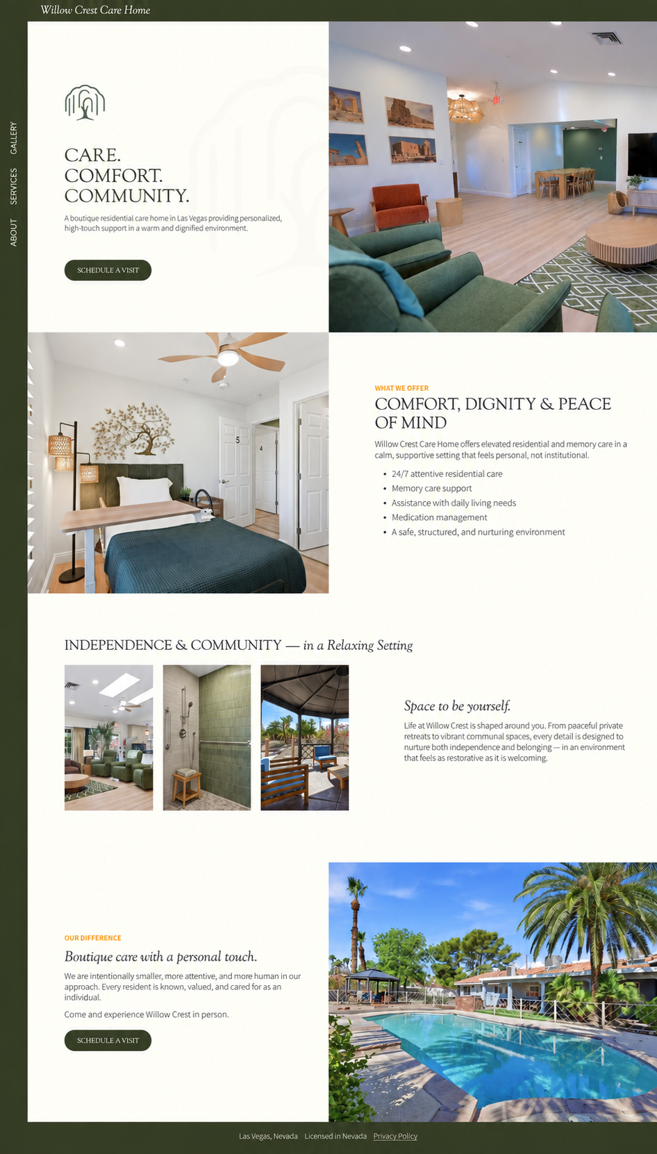
Willow Crest Care Home is a boutique residential and memory care home in Las Vegas built around a deliberately smaller model of care with consistent caregivers, individualized routines, and a setting that is more residential rather than clinical. That distinction is the heart of what makes Willow Crest different. Every decision was made to give visitors the same sense of warmth they'd feel in the facility itself.
Visuals
The site sits inside a deep forest green border so the experience is framed. Then, the ivory content area reads as a room you've stepped into. The unusual navigation lives inside that frame, set vertically along the left edge so it stays available without ever competing for attention.
The color story is ivory, forest green, and a measured touch of mustard yellow. Ivory carries the majority of each page, avoiding the sterile white that so often signals a medical environment. Forest green grounds the identity with something natural. Mustard is reserved for small “eyebrow” labels above headlines, and functions as gentle wayfinding.
Typography pairs a serif with a sans serif, both kept simple and elegant. The serif handles headlines, where it lends dignity and a residential warmth that a sans alone wouldn't carry. The sans handles body copy for clean legibility, set at generous sizes for an audience that skews older and is often reading carefully. A serif italic gives the site a second, gentler voice alongside the formal capitals of the section headings.
Photography does the heaviest lifting. Professional shots of the facility capture its ambient lighting from cans and soft fixtures, and residential furnishings. The site design was matched to that photography rather than the other way around, so the digital and physical spaces feel like one continuous environment: the green upholstery, warm wood, and woven fixtures in the rooms are the same palette the site is built from. Exterior shots of the pool and palms place the home firmly in Las Vegas.
Brand iconography runs beneath the content as subtle background watermarks. It gives each page texture and a sense of craft, reinforces the identity, and does it without introducing heavy graphic elements that would compete with the photography or disrupt the calm.
Structure
The site is intentionally small: four pages and a popup contact form. Families researching care are usually doing it in a difficult moment, often quickly, often on a phone. A sprawling site would ask them to make more decisions at exactly the point where they have the least capacity for it. A tight page count meant every piece of information had to earn its place.
The homepage opens on the three-word promise — Care. Comfort. Community. — which sets the emotional register immediately. From there it moves in an alternating rhythm. Each section holds one idea and one image so the page can be understood at a glance or read closely.
Each of the three interior pages does one job. About holds the philosophy behind the smaller model of care and speaks to the family rather than the resident. Services is organized so a visitor comparing options can scan rather than read end to end. The Gallery lets the family picture where someone they love will actually live, and that's often the page that settles it.
Contact is handled by a popup form rather than a page of its own, which keeps the page count simple and the navigation down to three items. The form is triggered by Schedule a Visit buttons placed at natural decision points throughout the site. Someone ready to act can do it where they stand, without navigating away and losing their place.
In the end, the warm palette, unhurried content, and care taken on the details combine to help make a difficult decision feel less like an evaluation to get through and more like being welcomed in.