
How to Design a Website You Don’t Need to Redesign in a Year
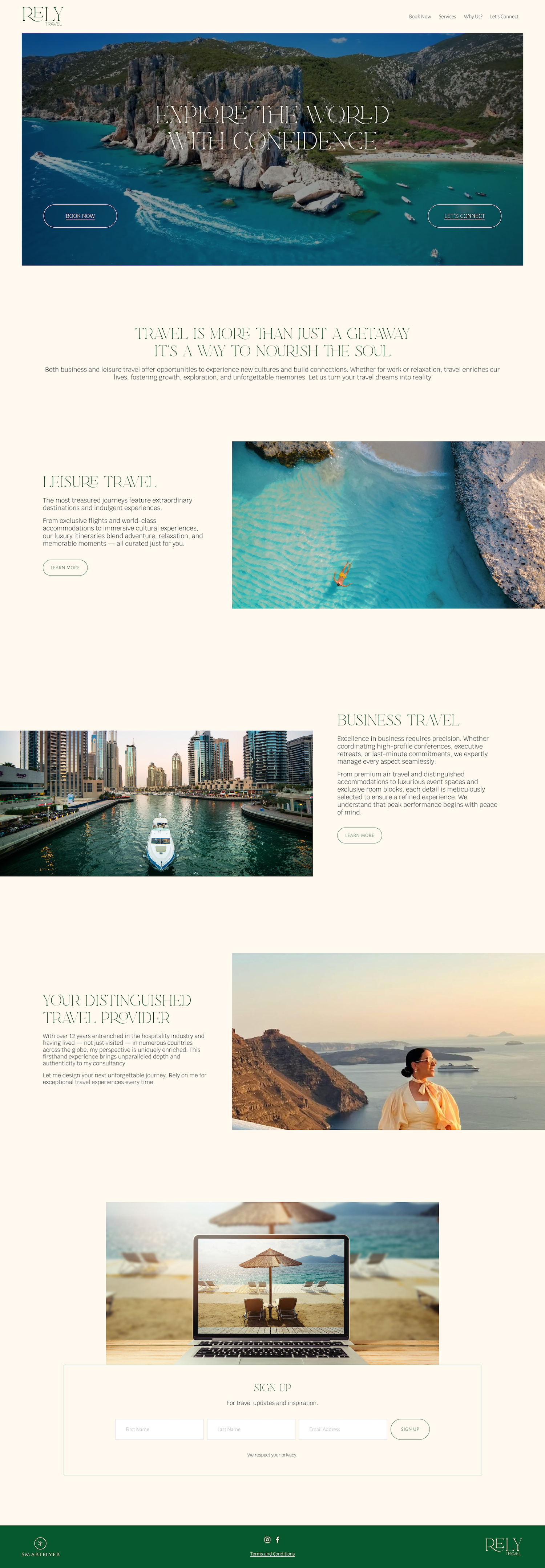
A redesign for a business rebrand, service refocus, or just for fun is the right time to do so. But to have to do so because the website started to feel dated too soon is not ideal. By contrast, a website built for resilience is one whose design and messaging stand the test of time. The following are ways to set your website to withstand a few years out in the digital landscape:
Classic choices outlast current ones
Design trends have a shelf life you can nearly set a watch by. Full-bleed autoplay video headers. Heavy parallax scrolling. Gradient mesh backgrounds. Oversized brutalist type. Every one of them reads as sophisticated for roughly eighteen months and then begins actively dating any site that used them.
The alternative is choosing a more elegant, timeless style:
Generous margins and white space. Most sites are too crowded, and crowding is the fastest way to look cheap regardless of what year it is.
A type hierarchy with genuine contrast. Two typefaces, used consistently, with a clear size and weight relationship between levels, that conveys quality and professionalism.
A restrained palette. Two or three colors with intent behind them, not five because the brand deck had five.
Layout that follows the content. When the structure comes from what the business actually needs to communicate, it ages differently than a structure imposed on the content from a template.
Photography that isn't styled to a moment. Heavy color grading, specific filter treatments, and whatever the current stock photography aesthetic is will all date. Well-lit, well-composed, honest images will not.
All of this isn’t to say, "never follow trends." If your audience judges you on being current, such as a streetwear label, a nightlife venue, a music festival, a beauty brand selling to people who follow beauty closely, a site that looks timeless looks out of touch. The eighteen-month shelf life is acceptable because the brand expects to refresh on roughly that cycle anyway, and has budgeted for it.
Build only what you will actually maintain
The most common thing that makes a site look neglected is not the design. It is a page nobody has touched since launch.
An abandoned blog is the clearest example. Three posts from three years ago are worse than no blog. A visitor reads it as a signal about how you run your business: that things get started and then dropped. The same applies to a case study section with two case studies. A press page with one link. A team page listing someone who left. An events calendar with nothing upcoming. Nine service pages sound thorough in a planning conversation. In practice, they compete with each other for the same search terms, they say largely overlapping things, and every one of them needs updating when the offering changes. So none of them get updated.
The useful question during planning is not "what could this site include." It is: who is updating this, and when. If there is no honest answer, the page should not be built. A four-page site that is entirely current outperforms a fourteen-page site where four pages are current, and ten are stale.
Dependencies you don't control
Every third-party element on a site is a small bet that another company will keep doing what it is currently doing.
Custom code injection is the sharpest version of this on Squarespace. Code added is not covered by platform support, and it can break when the platform updates. Anyone who moved a site from 7.0 to 7.1 has experienced this: the custom scroll effect, the hidden-header hack, the CSS overriding the template's spacing. The same exists for embedded tools. Social feeds break when an API changes. Booking and scheduling widgets get acquired and sunset. Third-party plugin marketplaces have products that stop being maintained by their developers.
This is not an argument for using none of them, but instead, knowing which elements are critical and which are unnecessary fluff.
if this embed disappeared tomorrow, what breaks? A gap in the layout is fine. Customers can't reach you is not.
Content that dates itself
Small copy decisions determine how quickly a site starts feeling old:
Announcements written as announcements. "We're excited to share" reads as recent for about a month and as stale forever after.
Year references. "Our 2024 approach" needs revisiting in January, whether or not anything has changed.
Counts that increment. Fifteen years of experience becomes wrong every twelve months.
Titles and named individuals throughout the copy. If a founder's name and title appear on six pages, a role change means editing six pages.
Seasonal imagery on a homepage hero. Autumn foliage in April is a small thing that reads as inattention.
The real test is how a website looks three years later when nobody's thought about it in a while.