
BE Wellness Center: A Light and Elegant Space for Healing
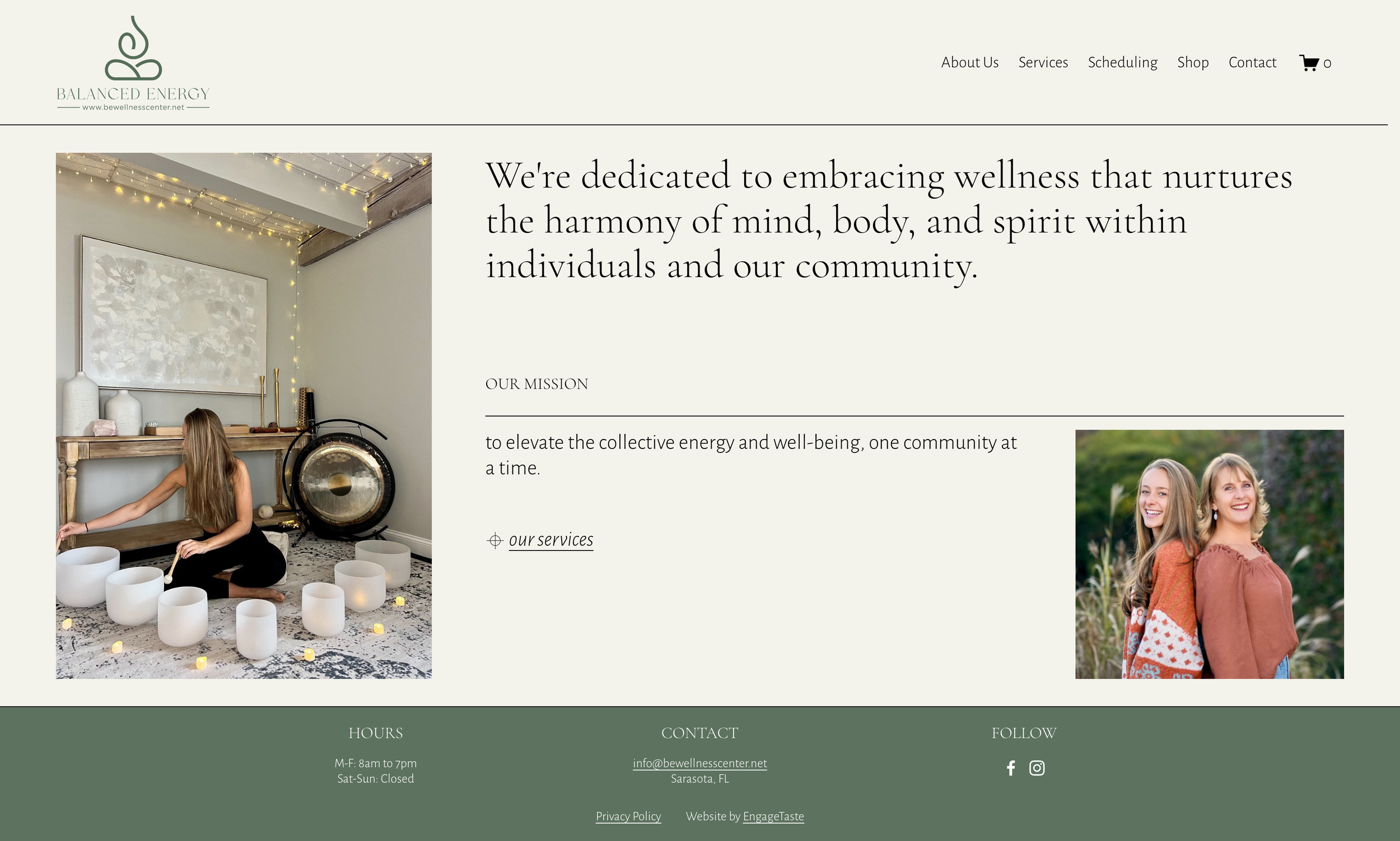
The BE Wellness Center’s new website embodies the founders’ philosophy of harmony, healing, and connection and welcomes visitors into a serene and nurturing environment that mirrors the warmth and intention behind BE Wellness Center’s mission.
Light and Airy Aesthetic
The website embraces an elegant, spacious design that ensures content feels open and inviting. Key elements include:
Generous Spacing: Wide margins and intentional line breaks allow content to breathe, making information easy to absorb.
Refined Lines and Small Graphics: Delicate linear elements subtly guide users through the site, adding structure while maintaining a soft, flowing feel.
Textural Depth: The muted, oversized background logo serves as a subtle yet effective visual anchor, enhancing the site’s sophistication without overwhelming the content.
Warm and Welcoming Colors
A soothing combination of yellow, ivory, and warm green/yellow immediately greets visitors with a sense of comfort. These colors were chosen to:
Reflect Healing and Balance: Yellow hues evoke warmth and positivity, while green tones symbolize renewal and connection to nature.
Create a Harmonious Environment: The soft transitions between these hues ensure a cohesive and visually engaging experience.
Enhance Readability and Focus: The warm-toned palette provides a gentle contrast, making text easy to read while maintaining a sense of calm and flow.
Nature-Inspired Imagery
Nature plays a crucial role in the BE Wellness Center’s philosophy, and this connection is subtly woven into the Service page with thin stock photos of lush greenery placed next to each description, reinforcing the center’s holistic approach. These images:
Strengthen the Site’s Welcoming Vibe: The selected greenery reflects the tranquility and rejuvenation that the center promotes.
Balance the Airy Layout: The carefully placed imagery adds visual interest while maintaining the spacious, minimal aesthetic.
Subtly Guide the User Journey: By aligning nature photos with service descriptions, the design creates a natural flow that leads visitors deeper into the content.