
From Portfolio to High-Value Consulting Brand
Deanna Pai is a writer, editor, and consultant whose work lives at the intersection of what people love and what brands need. Her new site reflects her deep understanding of what makes beauty content resonate, while also being stylish and showcasing the impressive breadth of Deanna’s work.
The site is kept intentionally simple, which gets straight to the point, supporting her brand positioning as someone who can cut through noise and deliver what works. From the color palette to the typography, every choice was made to feel editorial, like flipping through a beautifully designed print magazine. For brands seeking someone who understands both the editorial world and the evolving needs of digital audiences, this site becomes an easy yes.
A Professional Palette
The brand colors—warm taupe, rich olive, and rust—are warm and sophisticated. They nod to the natural beauty world while being grounded in a fashion-forward, modern vibe. They also echo the tones seen in much of Deanna’s published work, tying everything together visually.
Bold, Feminine Typography
A bold, modern serif establishes sophistication and confidence in headings, while a clean, versatile sans serif keeps body text accessible and easy to read. The combination is perfect for someone who moves effortlessly between fashion glossies, data-driven content, and direct-to-consumer storytelling.
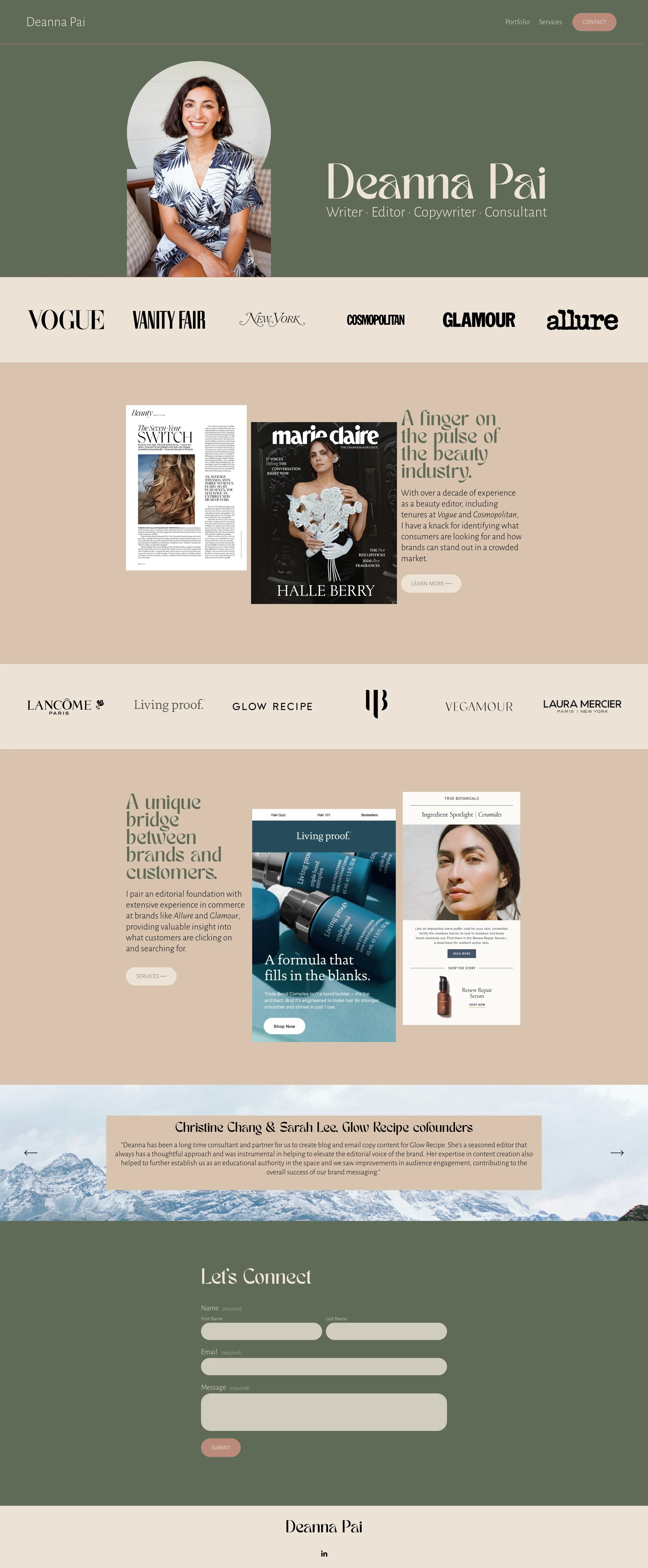
Built Around Proof
From the start, it was clear this site should center social proof. The site showcases Deanna’s work through a curated collection of samples from major publications. Featuring bylines and placements, instantly building credibility. It lets visitors see at a glance the caliber of brands and editorial platforms she’s worked with—no extra explanation needed.