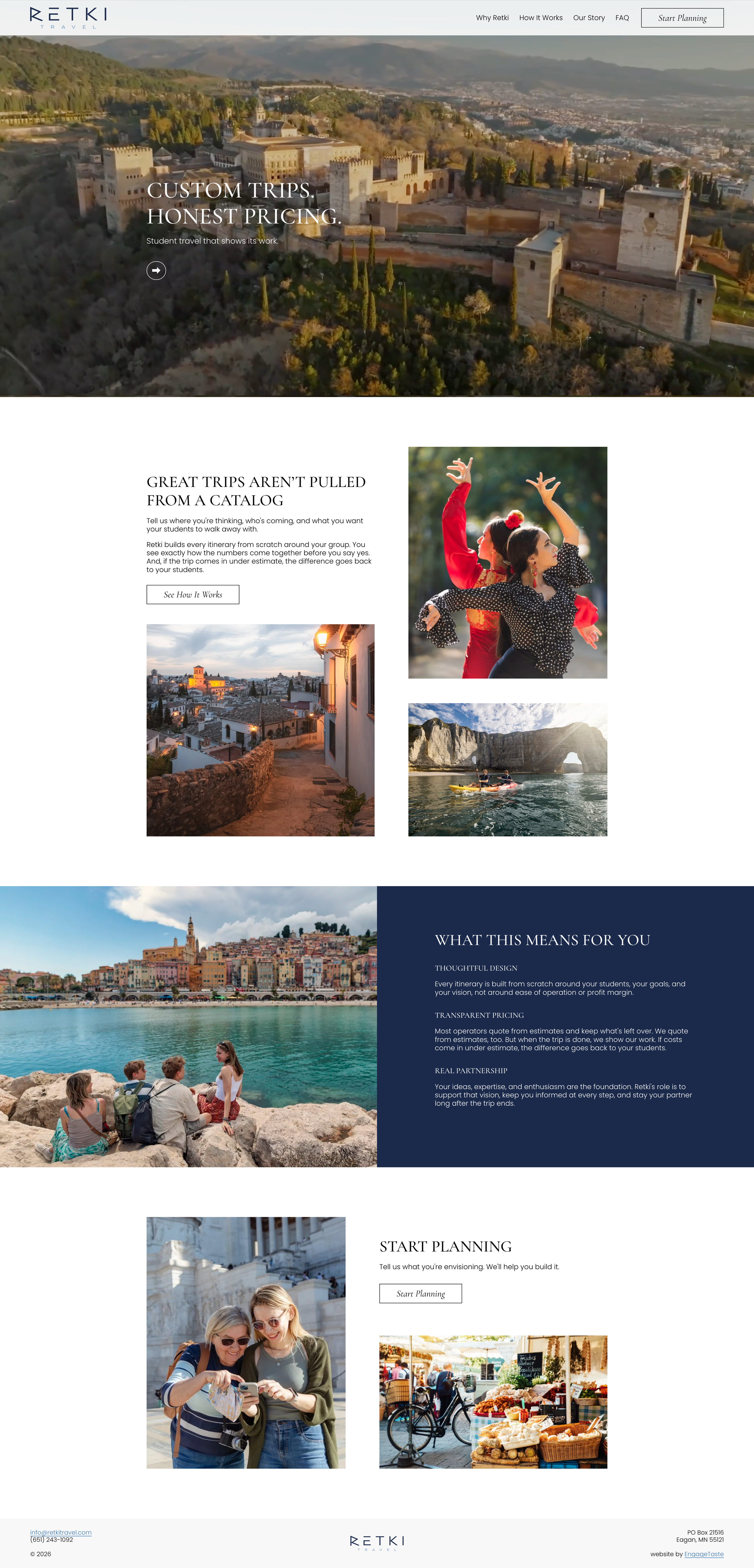
Retki Travel is Built Around the Students
There is a particular kind of trust that has to be built before a teacher will put forty students on a plane. Retki Travel was founded on the premise that student travel has a transparency problem. Traditionally, operators build trips from catalogs, quote from estimates, and keep whatever's left over when the final costs come in lower.
Retki does it differently: every itinerary is built from scratch, every cost line is visible before anyone commits, and when the trip comes in under estimate, the difference goes back to the students. That level of integrity needed a website that could embody it.
A Website as a Sample Experience
A full-bleed video section pulls the viewer directly into the places Retki sends students: aerial footage of coastlines and old city rooftops, light falling through the nave of a cathedral, the particular quality of a market street in the early morning. It's an invitation to understand that these trips are formative experiences.
Color and Type
White in generous supply, deep navy as a grounding presence, and a turquoise accent that reads as both Mediterranean and modern. It's a combination that feels trustworthy, warm, and welcoming. The typography pairs a classic serif with a restrained sans-serif, a pairing that references Retki’s old-world-meets-new destinations.
Easy Organization
Navigation was kept deliberately simple. Retki's audience — teachers, department chairs, and trip coordinators — are busy people who come to the site with specific questions. How does this work? What will it cost? How do I start? The information architecture answers those questions in order, without detours or jargon.
Visuals
The photography throughout the site follows a consistent logic: beautiful destinations, yes, but with students present in roughly half the images. This was an intentional editorial choice that reminds the viewer that the point of all this beauty is the people experiencing it. The cobblestones and the cathedral ceilings are the education.