
People notice polish, but they respond to presence
Have you ever thought to yourself when visiting a new website: The layout is neat. The typography is balanced. The colors go together. The site technically functions well, yet it feels… merely assembled?
A perfectly fine website might feature clean sections stacked on top of each other. The result is tidy and pleasant, but it lacks depth. There’s no sense of story, personality, or point of view.
Flat Design
Flat design usually isn’t the result of a mistake. It comes from stopping at the surface level. Nothing shifts as you move through it. Every part holds the same weight. There’s no contrast or hierarchy. It’s a site full of information, but not an experience. The content might be strong, but without pacing, contrast, and visual cues, the viewer has no path, only options.
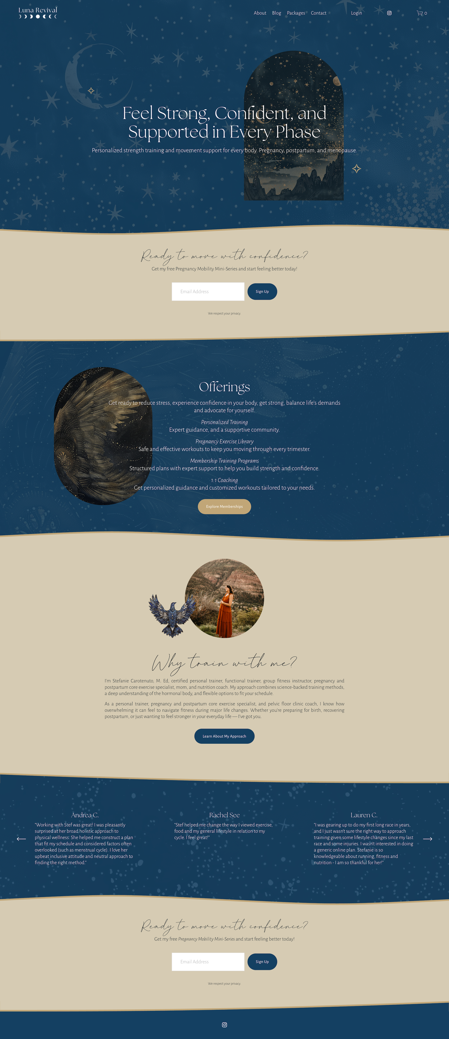
Designing with Depth and Texture
A site with depth guides you through a sequence of moments rather than presenting everything at once. Some areas draw you in with scale or bold type. Others slow you down with space or detail. Texture and layers give the eye subtle anchors: a faint pattern behind a headline, a thin line that repeats across pages, a soft grain behind images.
A site doesn’t need to be busy to have depth. It just needs direction. Here are some ways I build flow and texture into a page:
Shift pacing through varied section lengths
Use scale to create contrast
Add more space around ideas that need time to land
Choose images that share tone and light, not just subject
Use typography to shape mood, not just readability
Add subtle brand textures to signal transitions or set a tone
None of these work alone. They play off of each other in studied balance.
How To Approach It
If your site feels flat, don’t start by adding more content. Start by asking: What do I want someone to feel as they move through this? Then adjust spacing, rhythm, contrast, and texture to support that answer. The smallest shifts can change the entire experience.