
Live to Flourish: A Digital Oasis for Growth and Healing
The website for Live to Flourish beautifully reflects Stephanie Ulfig’s mission of helping individuals thrive and grow through a holistic approach to healing.
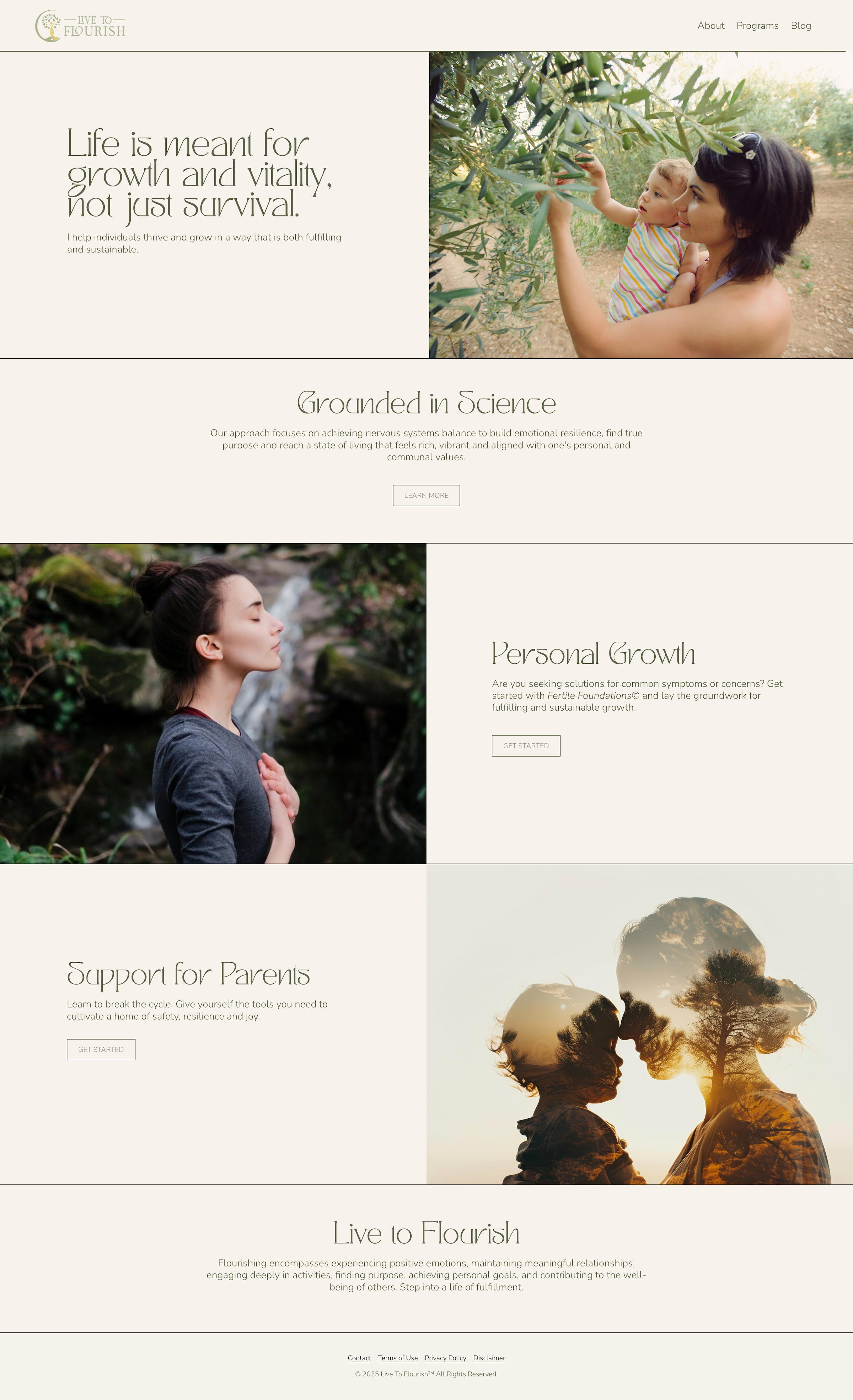
The new site is a testament to the power of thoughtful design in conveying a mission of healing and growth. By blending a soft, healing color palette with lush, relatable imagery, the site creates a digital sanctuary that reflects Stephanie’s dedication to helping individuals thrive. The result is a visually cohesive and emotionally resonant platform that invites visitors to begin their journey toward living with vitality, balance, and purpose.
Design Highlights
1. Soft, Healing Color Palette
The site’s palette of warm, almost yellow ivory/beige and a rich dark green creates a serene and restorative atmosphere. These colors draw visitors and set the tone for an experience that feels both nurturing and empowering by:
Evoking Warmth and Comfort: The ivory tones provide a soft, welcoming backdrop that feels safe and inviting.
Inspiring Growth and Vitality: The warm dark green symbolizes growth, harmony, and connection to nature, aligning with the site’s message of thriving and flourishing.
Creating Balance: The interplay of these tones establishes a sense of equilibrium, reinforcing the site’s focus on emotional and nervous system balance.
2. Lush, Vibrant Imagery
The use of vibrant, warm-hued stock photos featuring women and children engaged in moments of reflection, yoga, meditation, gardening, and joyful living adds depth and relatability to the website. These images:
Represent Stephanie’s Audience: The photos reflect the diverse individuals and families she works with, creating a sense of inclusion and connection.
Inspire Positivity: Each image radiates warmth and vitality, visually reinforcing the site’s themes of growth and well-being.
Complement the Palette: The warm tones in the photos harmonize beautifully with the beige and green color scheme, enhancing the site’s visual cohesion.